Malavika
Campus Trash
01 - Identifying the problem
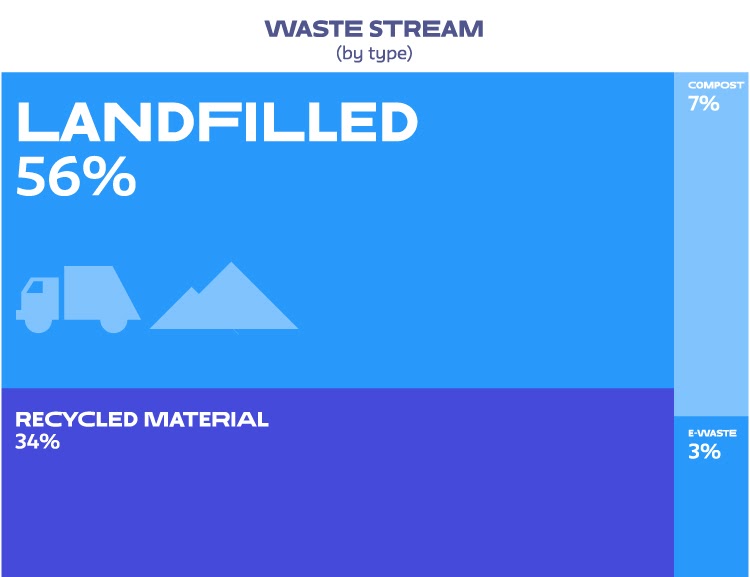
75% of America's waste is recyclable, and we only recycle about 30% of it.
I learn that this can be attributed to the lack of public knowledge, overflowing bins, and reusable materials being thrown away.
9/10 students said that they would recycle "if it were easier". More than 2/3rds of the waste generated at The New School could be diverted simply with better sorting at the bin.
02 - Research and insights
Labels don't provide detailed information –– students often don't know which bins to use for different types of waste. There are no “special” waste bins for unconventional items. There aren't enough donation bins on campus –– design students end up with left over wood, metal and cardboard pieces that can be donated and reused in other projects instead of being thrown away.

03 - Goals
- Target audience: students on campus.
- Use technology to clear any doubts regarding which bins waste should go in.
- Point students to the nearest disposal option, on and off-campus.
- Alerts if a trash can is at maximum capacity/overflowing.
- Connect students with excess materials to donation bins instead of trash cans.
04 - The Solution
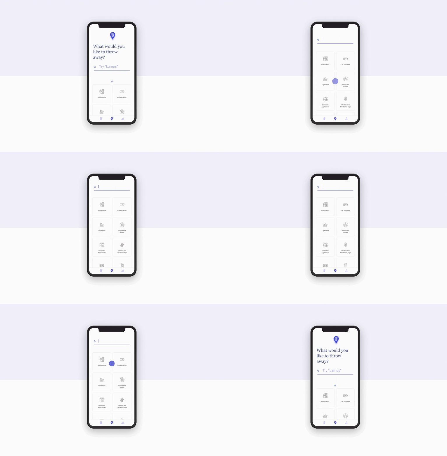
Search
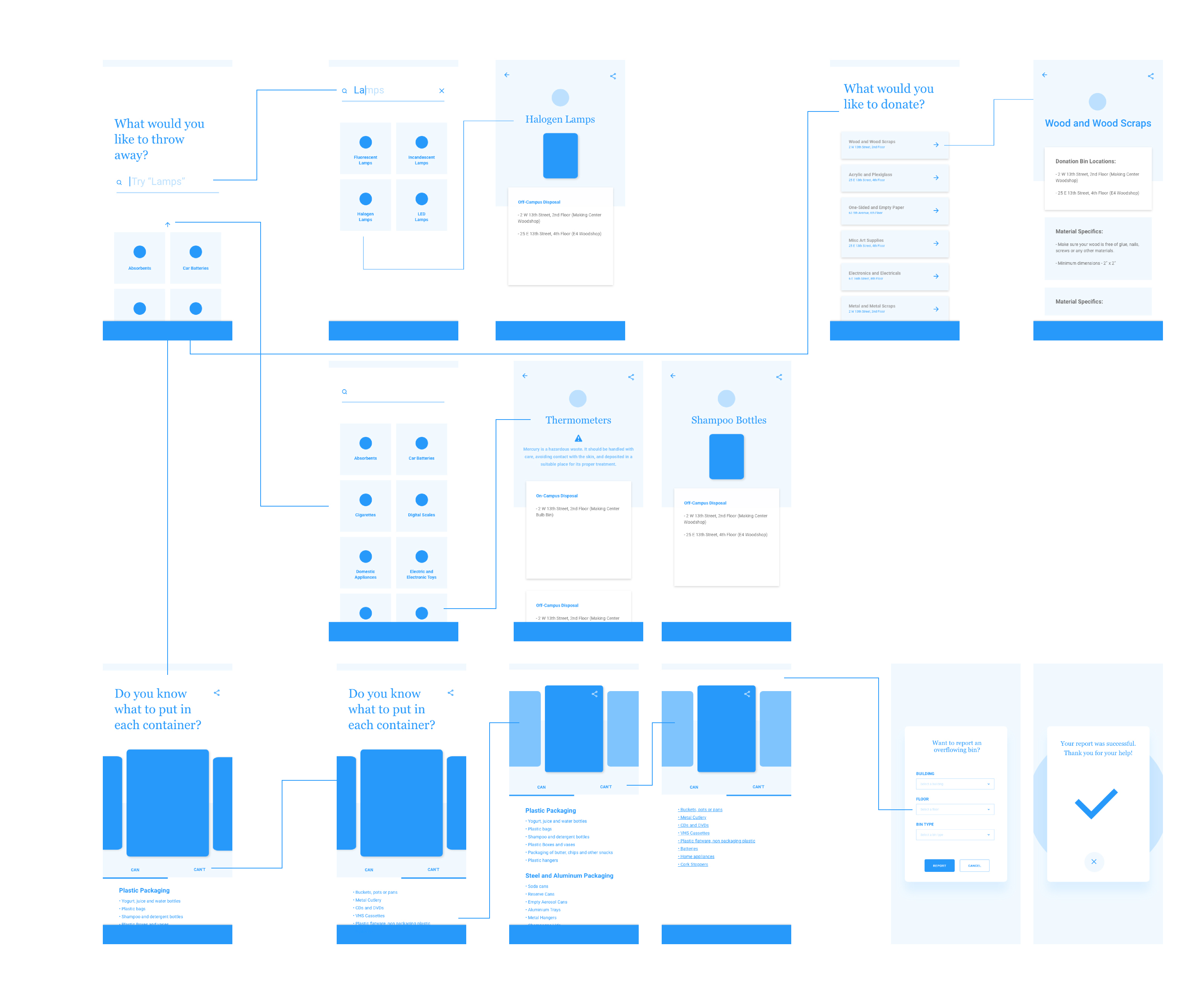
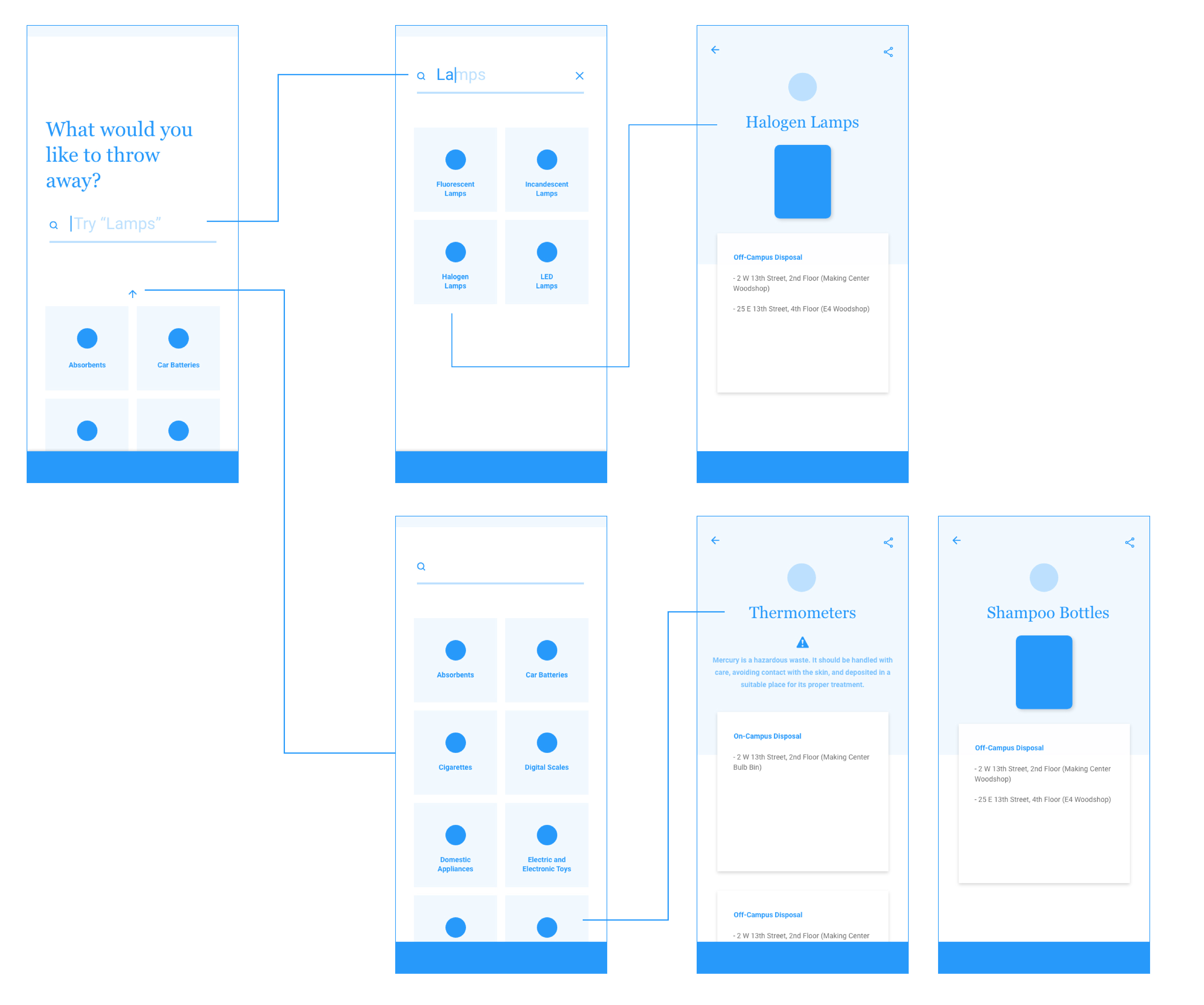
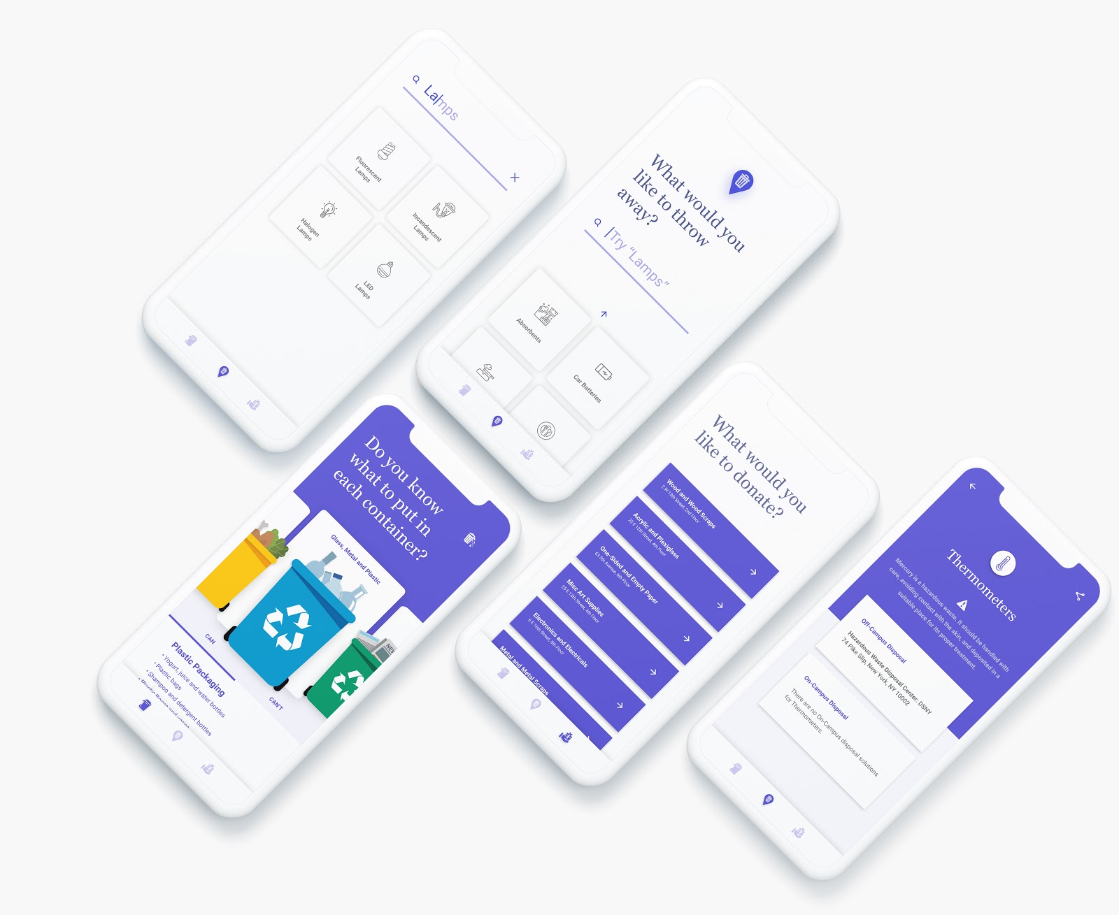
The search feature, also the landing page of the application, allows users to look up any material and find information on how and where to dispose of it.

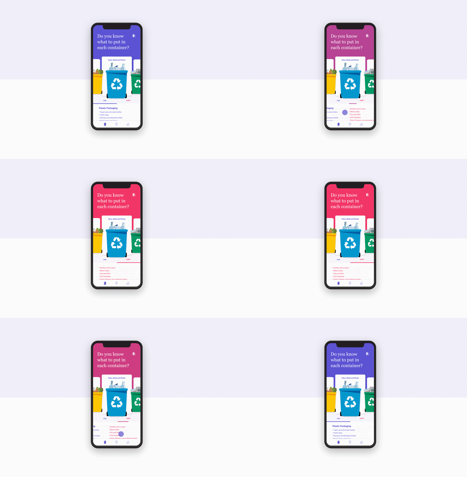
Learn
Dive into the materials that can and can't go into a particular bin. This is for users who want to know not about a specific material, but a specific bin.

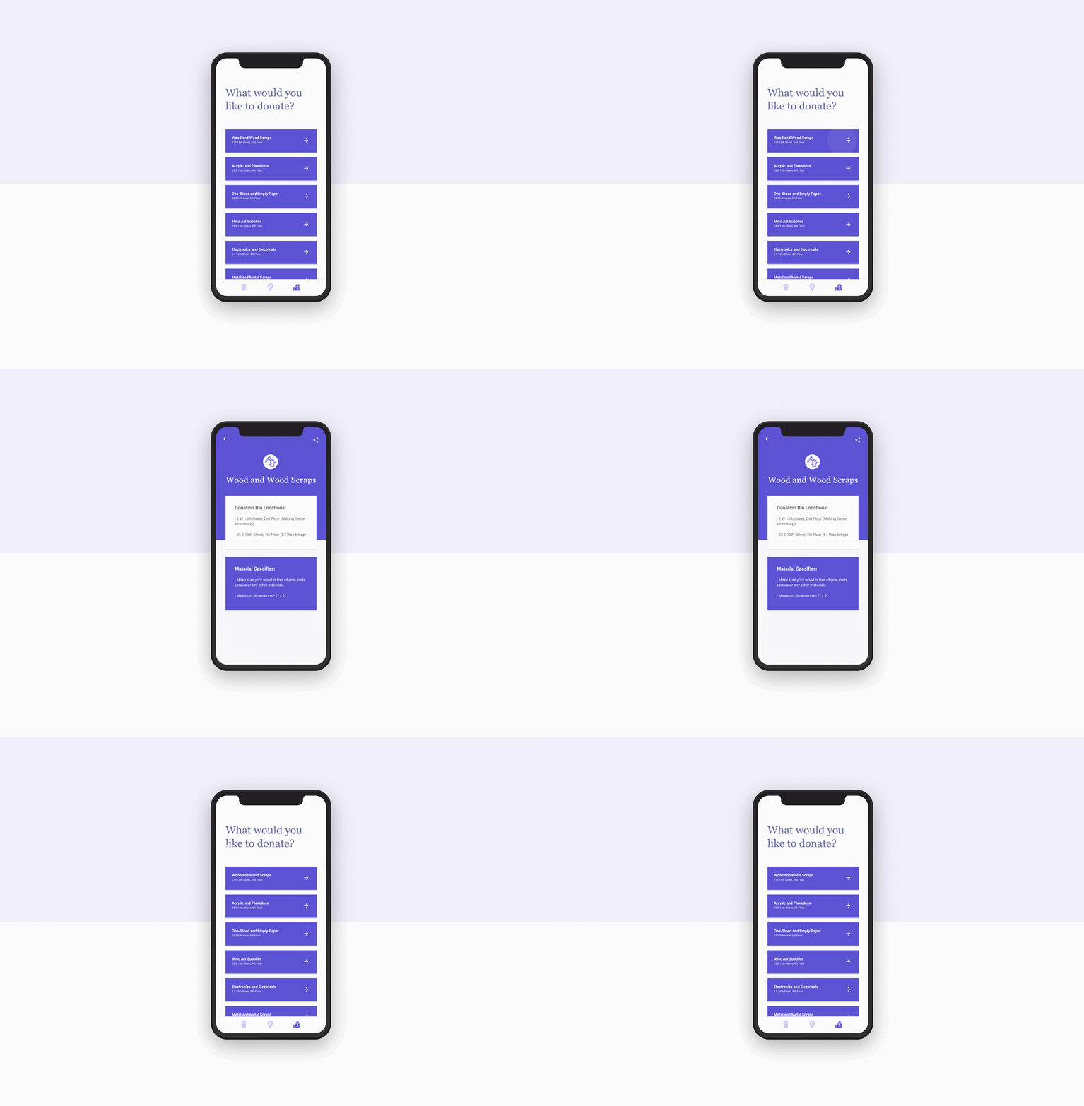
Donate
Students are able to access donation bins containing scrap material. Each item contains a list of available locations along with material specifics.

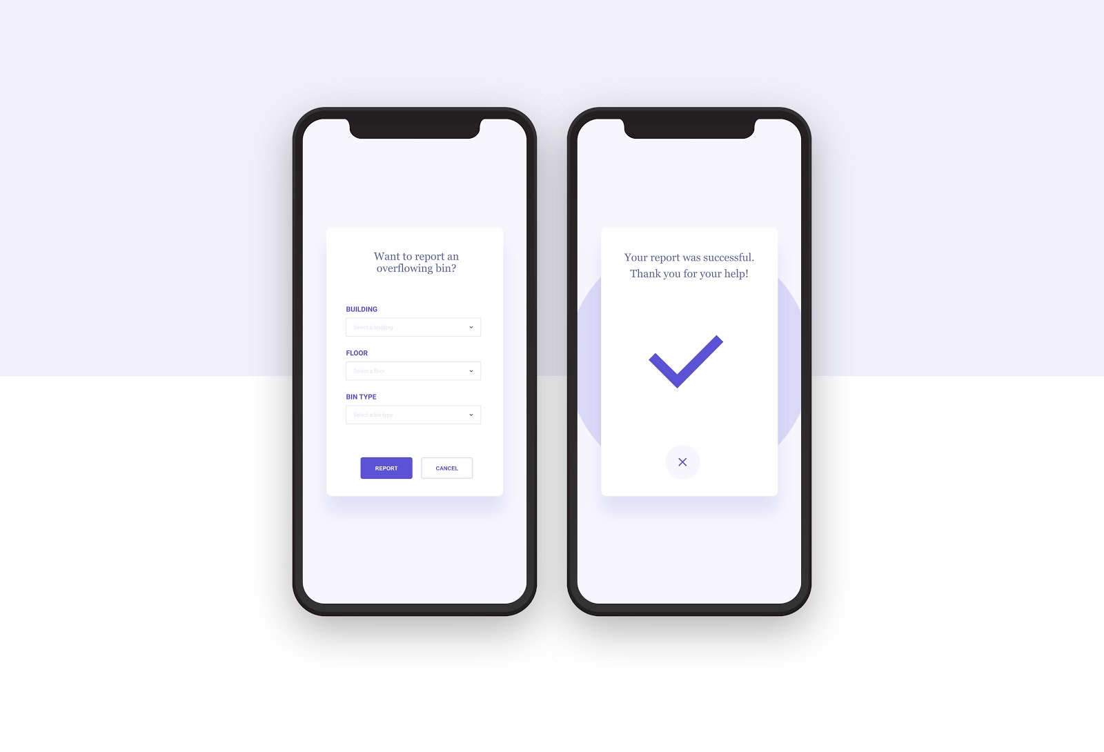
Help
The final feature of the application is allows users help inform maintenance staff of an overflowing bin. Users can simply input building, floor and bin type.

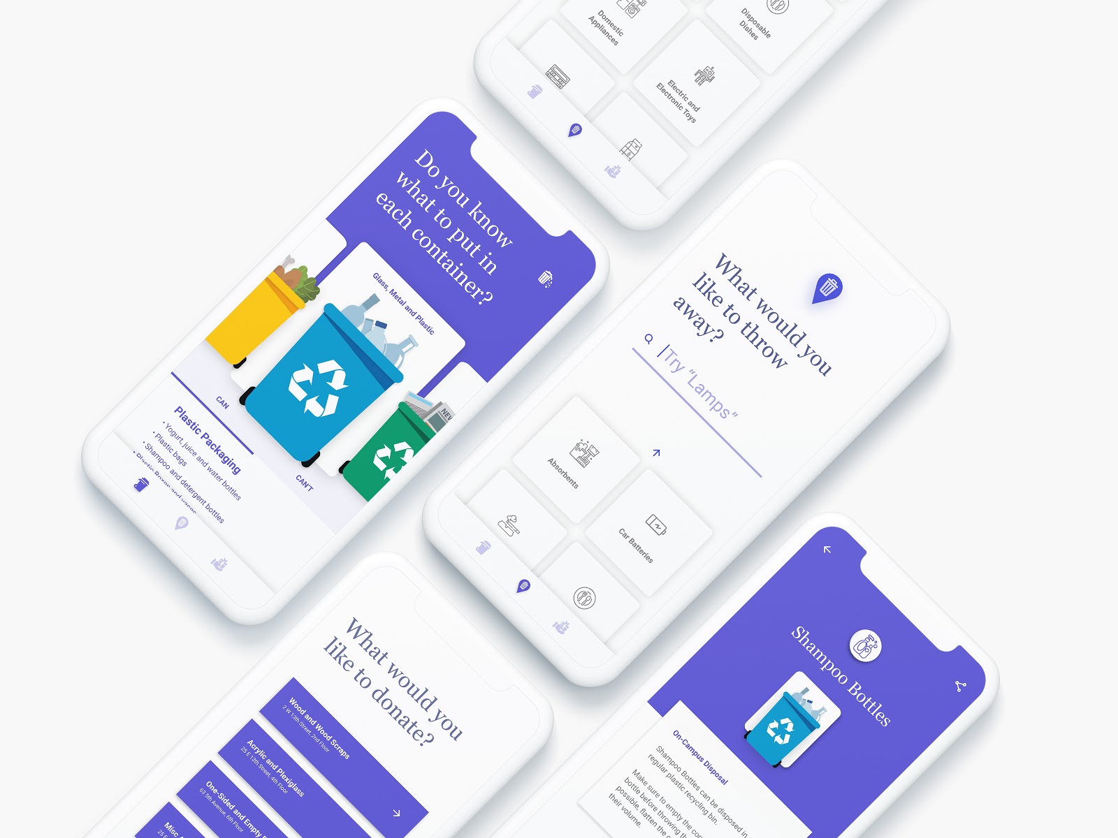
I ultimately chose to use a purple for the primary colour to encourage users to feel "royal" while using the app. This feeling of royalty and simplicity, along with the friendly look and feel of the interface would hopefully encourage students to actively use it and dissociate from the feeling of discomfort or uncleanliness when it comes to waste management.